
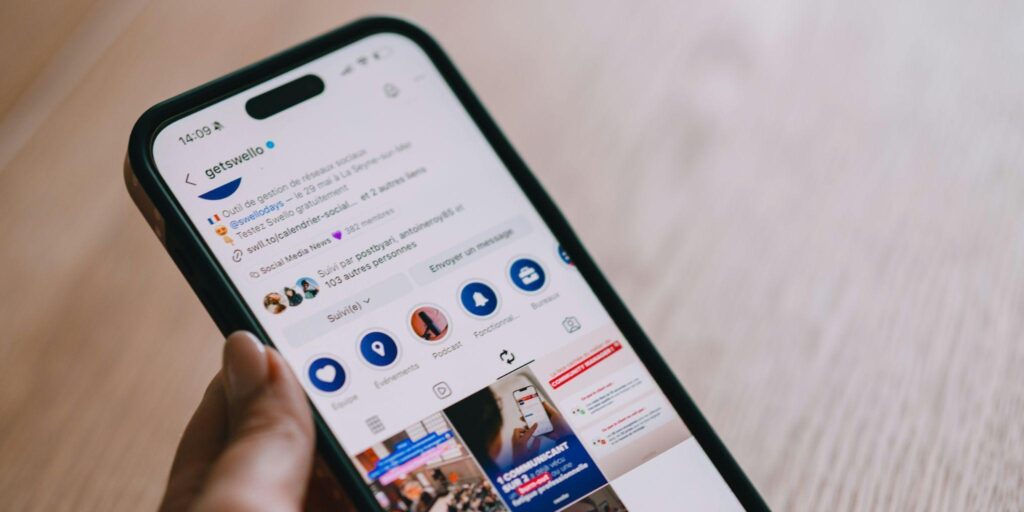
Two bios sit side by side in a search result. One reads as three short lines of plain words. The other stacks five emojis, a sparkle divider, and a rainbow of symbols. Which one does a stranger actually finish reading before tapping follow or scrolling on?
The question matters because a bio is the only paragraph on Instagram that a visitor reads by choice. Every other piece of text competes with a video or an image; the bio sits alone under the profile picture, and the reader has already decided to look. So the length, the rhythm, and the visual density of that block decide whether attention lingers or leaves.
Designers who write about profile pages often compare bio styles the same way media buyers compare landing pages on this website or any other product surface, watching how quickly the eye finds the one line that matters. The lesson from both worlds is the same. A block of text holds attention when a reader can parse it in one glance and still find a reason to stay.
How the Eye Actually Reads a Bio
Reading on a small screen is not reading in the classical sense. It is scanning with occasional focus. A visitor looks at the profile picture, drops to the display name, then to the bio, and their eyes fix on the first anchor point that promises meaning. That anchor is different for different styles.
According to reading pattern research from usability labs, mobile users skim in a shape closer to a shallow F than a full-page sweep, catching the first two or three words of each line. That behavior rewards short lines and punishes long paragraphs regardless of whether the content is plain text or heavily decorated. You can see the pattern documented by usability researchers at the Nielsen Norman Group, whose eye-tracking studies apply to profile pages.
What Minimalism Does to the First Glance
A minimalist bio front loads meaning. Three words, a line break, three more words. The eye lands, understands, and either commits or moves on within about a second. There is no decoration to decode, so the cost of reading is low, and the risk of misreading is lower still.
What Emoji Density Does to the First Glance
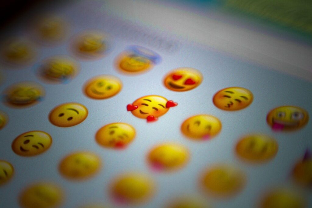
An emoji-heavy bio does the opposite. It offers color and rhythm first, then asks the reader to translate. A camera icon plus a pin plus a coffee cup can mean a photographer, based in a city, likes cafes. But that translation takes a beat, and if the icons feel random, the beat becomes a pause, and the pause becomes a scroll.
A Side-by-Side Comparison You Can Borrow
The clearest way to judge attention is to write both versions of the same bio and read them back after ten minutes. Below is a short reference grid built from common creator categories in India, focused on which style tends to hold a stranger for longer than three seconds.
|
Account type |
Minimalist strength |
Emoji strength |
|
Freelance designer |
Signals calm confidence |
Risks looking amateur |
|
Food creator |
Feels editorial |
Adds warmth and appetite |
|
Fitness coach |
Feels serious and safe |
Feels energetic and open |
|
Travel diarist |
Feels literary |
Feels like a real trip |
|
Local business |
Reads as trustworthy |
Reads as friendly |
The Three-Second Test
Read the bio aloud once. If the meaning arrives before you finish the second breath, the bio holds attention. If you stumble on a symbol or reread a line, the bio is losing the visitor at exactly that point. This test works for both styles and takes no tooling.
The Screenshot Test
Take a screenshot, wait an hour, and open it cold. Whatever you remember first is what a stranger remembers. If you remember a phrase, minimalism did its job. If you remember a color or an icon, the emoji layer did its job.
Choosing a Direction That Lasts Beyond the Trend
The practical middle path most experienced creators settle on is a short bio with one or two intentional accents, chosen for meaning rather than decoration. A pin for a city, a book for a writer, a small flag for a language. Everything else earns its place by adding information the words alone cannot carry. That standard keeps a profile readable, keeps the visitor for a few extra seconds, and keeps the bio honest about what the account actually offers.
[a]https://unsplash.com/photos/white-yellow-and-green-round-plastic-toy-Cs3y8Mn6-Gk